
Should You Use A Component Framework? A Look At Amplify UI.

In my last YouTube video I discussed UI component frameworks. These frameworks make it possible to quickly add fully customizable, accessible components to your web applications.
Making a decision to add a component framework to your application isn't always easy. Some developers have the opinion that you should never use a UI framework at all. And that the only "true" path is to recreate everything from scratch or use a smaller library like Tailwind to only help with CSS.
Others, like myself, have a more programmatic approach. Yes, I agree that you should know the basics of HTML/CSS/JavaScript and you should be able to re-create any component that these component frameworks provide you.
On the other hand, adding a component framework is another tool in our toolbox as a developer. We can use it to cut down development time, or help us make sure our app is accessible to all. We should look at the pros and cons whenever we are adding a library/framework to our application. That analysis should drive the decision to add it or not. At the end of the day, our users won't care if we used a component framework or created all our designs from scratch, as long as the user experience is about the same.
Customization
One particular point I hear often from the anti-component framework crowd is customizing things can be difficult. This can be true, branded solutions, like Material UI, have a very unique look and feel. Depending on the implementation, it might be difficult to override the styles and themes to the exact specifications a designer might give.
I personally experienced this issue while working at my last job. I worked at a startup and we decided to use Angular Material to help save on development time. The designer we worked with was not aware of this fact, and the designs were completely the opposite of what Angular Material provided.
Several nice features common to Angular Material like, floating labels, and error messages were not to the designers liking.
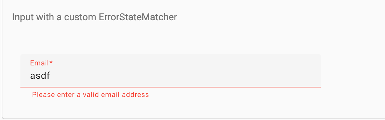
I spent countless hours overriding CSS, and googling around trying to find the exact CSS classes to override. It was a nightmare.
On the other hand, some component frameworks take the complete opposite approach. Radix offers a set of unstyled accessible components. Same with HeadlessUI, by the same makers of Tailwind CSS.
I think this is a good approach for some projects, but I personally would rather go with a framework that already has at least some styled components to work with. In case I didn't want to make any style changes, or just minor ones.
Amplify UI Middle Ground
On one side we have heavily branded solutions like Material, and the other we have completly unstyled headless frameworks like Radix. Is there a middle ground?
This is where I'd recommend Amplify UI. Amplify UI is a component library with over 40 accessible styled components. Amplify UI stands out in two ways:
- It's fully customizable with theming and component overrides
- It offers connected components to AWS services
Theming and Customization
Amplify UI uses design tokens, css variables and and an advanced theming system to provide multiple ways to style components and set the correct branding throughout the application. For individual component styling it offers style props for more fine grain control.

Theming is done with a theme object. From there you can override any tokens or breakpoints.
In the example below we are overriding the card component. With its own unique set of background colors, heading and text.
import { Card, Heading, Text, ThemeProvider } from '@aws-amplify/ui-react';

const theme = {
  name: 'custom-theme',
  tokens: {
    components: {
      card: {
        backgroundColor: { value: '{colors.background.secondary}' },
        outlined: {
          borderColor: { value: '{colors.black}' },
        },
      },
      heading: {
        color: { value: '{colors.brand.secondary[80]}' },
      },
      text: {
        color: { value: '{colors.brand.primary[80]}' },
      },
    },
  },
};

export const CustomThemeExample = () => {
  return (
    <ThemeProvider theme={theme}>
      <Card variation="outlined">
        <Heading level={6}>Heading text</Heading>
        <Text>Some sample text for this card.</Text>
      </Card>
    </ThemeProvider>
  );
};
Connected Components
Connected components allow you to drop in fully functional features that connect to backend AWS services with minimal boilerplate. Amplify UI offers an Authenticator, Account Settings, Geo and Storage File Uploader component.
These are unique to Amplify UI, and make it much easier to use AWS services along with Amplify. If your interested in learning more about these features, check out my last tutorial on using the Authenticator.
Conclusion
There is no one right answer to the question if you should use a UI component framework or not. I'd argue that it depends on the situation, the application your building, the timeline, and the experience of the developers.
I am quite certain solutions like Amplify UI are a good middle ground for those customers looking for an accessible performant component framework, and has the abality to be completly rethemed if needed. If your using Amplify or it's set of AWS services, it's a no brainer.
If you got this far reading this blog post thanks! Please let me know what you think, follow me and tweet me at ErikCH!